
 By
By
veryone loves a logo origin story.
This past weekend, as my brother and I discussed the launch plans for my upcoming book, he inquired about the origins of the Unfair Mindshare logo. It dawned on me then that I hadn't shared its origin story.
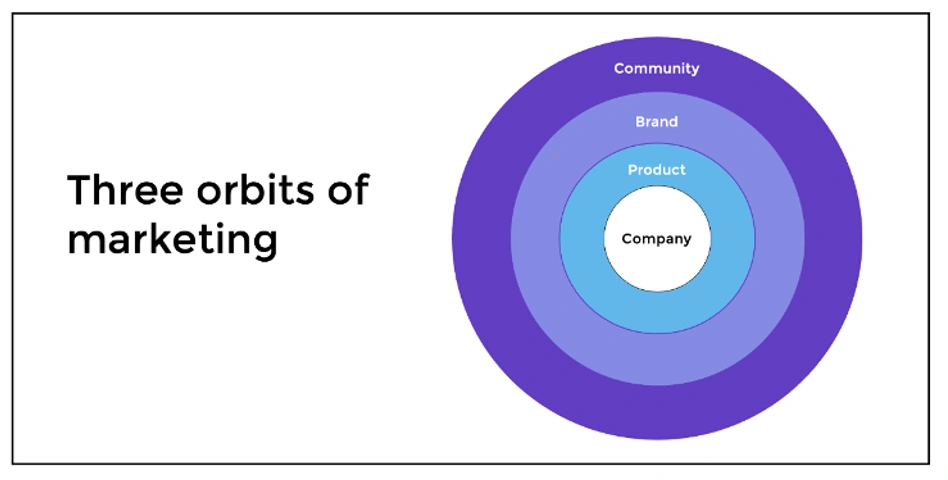
A year ago, I began penning the initial words for Unfair Mindshare: A CMO’s Guide to Community-Led Marketing in a Product-Led World. My firsthand experiences formed the backbone of the book's narrative, but it involved five interrelated orbits. Recognizing that it might be too intricate for my target audience, I sought inspiration to streamline it.

In preparation, I chanced upon a passage in The Scribe Method (a guide on crafting a compelling book):
“What’s the bestselling novel series of the past three decades? Harry Potter. Even though it targets a teenage/young adult demographic, 60 percent of its readers are adults. Why? Because writing for an astute, eager 12-year-old ensures clarity and directness, making the book even more attractive to older audiences. Consider this: Three of the top ten bestselling business books over the past 30 years are simple novels - "Who Moved My Cheese?", "The 5 Dysfunctions of a Team", and "The One Minute Manager". The takeaway? Conveying your message through clear and captivating stories is effective."
This wisdom prompted me to condense my five-orbit model into a three-orbit one, illustrating the interconnectedness of product, brand, and community in go-to-market strategies. I recognized that CMOs who venture into the third orbit—community—can influence markets more effectively, facing fewer competitive challenges. The savviest teams then synchronize efforts across these orbits to boost demand and enhance brand recognition.
The more I honed this three-orbit narrative, the more it resonated. After sharing it with a handful of industry peers, their feedback confirmed I was on the right path.
As for naming my venture, I extracted two words from my résumé that reflects several triumphs I’d achieved for various enterprises: "unfair mindshare."
Throughout my marketing journey, I've been driven by the pursuit of innovative strategies to stand out, capture attention, and secure an edge over competitors. Working with startups and scaling businesses, I navigated limited resources while striving to outperform larger rivals, aiming to amplify our presence and increase demand.
For the "Unfair Mindshare" logo, I collaborated with Melissa Schmidt, a gifted graphic designer with whom I've worked at two prior businesses. After briefing her on my narrative, I entrusted her with the creative reins.
From a range of concepts, Melissa presented the final design: a striking emblem with a core hub (representing a company) surrounded by three elliptical orbits (representing product, brand, and community). The boldest, fiery-red orbit signifies the third orbit—the space where "unfair mindshare" is realized. This vibrant hue also complements the red in the name, underlining its significance. The color red, synonymous with power and passion, aptly symbolizes the energy propelling businesses forward.
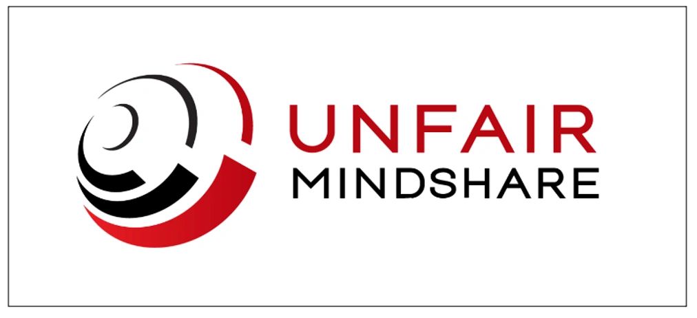
Her artistic vision captured the essence of the three-orbit model I'd envisioned, mirroring the holistic go-to-market strategies detailed in the book. It embodies the "unfair mindshare" philosophy.
It’s fascinating how origin stories often emerge from unforeseen collaborations or discussions. My logo’s story showcases the organic evolution of community-led marketing, where ideas germinate through connections and innovation sparks from diverse minds rallying around a shared mission. From this melange of voices, a cohesive force arises.
Every logo bears a tale of its genesis, infused with dedication and shared aspirations. The "Unfair Mindshare" logo will forever echo the power of community collaboration in achieving collective triumphs. Its story will accompany me as the book forges ahead, fostering new marketing and community connections.